New encapsulation method for Styled-Components with Babel
TL;DR: Use Private Class Names Instead of a Dedicated Component. Experimental
Styled-Components has brought something new to the table when in was first introduced and is one of the most popular CSS-related libraries out there with over 20k stars on GitHub. Style encapsulation has always been an issue in the web world, and people tried to solve it in many ways, of which Shadow DOM and Angular’s emulated view encapsulation.
I like the approach of Styled-Components, mostly because it’s compatible with React which seems to be the leading UI library in the echo system as for now, but also because of how nicely it sits in the virtual DOM tree.
For those who aren’t familiar with Styled-Components, here’s a quick example of how you would apply style on a React.Component:
const Button = styled.button`
  border-radius: 999px;
`

const RedButton = styled(Button)`
  color: red;
`

const GreenButton = styled(Button)`
  color: green;
`

const BlueButton = styled(Button)`
  color: blue;
`

const Dashboard = (
  <div>
    <RedButton />
    <GreenButton />
    <BlueButton />
  </div>
)
However, as good as it is, there are some major drawbacks for creating a dedicated component for each styled element:
- It’s longer to write than defining a class.
- It’s less efficient, because it has to go through the rendering phase of React.
- It breaks the HTML naming conventions and we can’t differentiate between a regular element and a React.Component anymore.
- IMHO, combining multiple styles with Styled-Components mixins is less elegant and not as easy as specifying multiple classes per single element (see issue on GitHub as reference).
When I was writing the WhatsApp-Clone I used
a different approach to overcome the problems mentioned above. Instead of creating a dedicated
component for each styled element, I used a container that has all the CSS rules with private
classes. By private classes I mean, classes which start with an underscore (e.g. _my-class). This
way I’m less likely to collide globally defined CSS rules:
const DashboardStyle = styled.div`
._btn {
border-radius: 999px;
}
._red-btn {
color: red;
}
._green-btn {
color: green;
}
._blue-btn {
color: blue;
}
`
const Dashboard = (
<DashboardStyle>
<button className="_btn _red-btn" />
<button className="_btn _green-btn" />
<button className="_btn _blue-btn" />
</DashboardStyle>
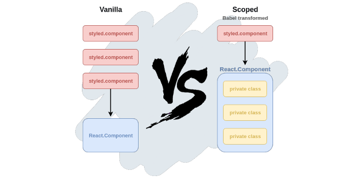
)As much as I love this approach, it doesn’t achieve full encapsulation. A nested child component which has a similar class selector as its parent will result in a merged style, which is not necessarily what we want. Each component should leave independently of its ancestors, which is what Styled-Components are all about.
Introducing babel-plugin-scoped-styled-components
Indeed, this problem is solvable with a transpiler. Not only we can achieve full encapsulation this way, but it’s also highly efficient due to its independence from a runtime library.
So by loading a single plug-in, the recent code snippet I just showed you would be transformed into the following code:
const DashboardStyle = styled.div`
  .${props => props.__scopename}-btn {
    border-radius: 999px;
  }

  .${props => props.__scopename}-red-btn {
    color: red;
  }

  .${props => props.__scopename}-green-btn {
    color: green;
  }

  .${props => props.__scopename}-blue-btn {
    color: blue;
  }
`

const Dashboard = (
  <DashboardStyle __scopename="__scope0">
    <button className="__scope0-red-btn" />
    <button className="__scope0-green-btn" />
    <button className="__scope0-blue-btn" />
  </DashboardStyle>
)
I also thought of creating a runtime wrapper around Styled-Components where I basically iterate
through props.children and edit their class names, but there are some advantages for using an AOT
compiler over a runtime solution:
- You don’t have to import a library different than
styled-componentsand it’s easily integratable with existing projects. - It’s more efficient.
- Encapsulation can be done based on the module you’re currently at and not based on the virtual DOM tree. This behavior is not craved in stone as it can be easily modified by specifying certain attributes, but at-least the option is there.
- It’s more strict and declarative.
The source code is available on GitHub, or it can be downloaded via NPM (or Yarn):
npm install babel-plugin-scoped-styled-componentsOnce you install it, be sure to load it in your .babelrc:
{
  "plugins": ["babel-plugin-scoped-styled-components"]
}
I’m aware that there are certain limitations to that approach as for now, but I would like to see more interest and contribution before I continue any further with the development. Please share your thoughts everyone, let me know what do you think by commenting below or by opening an issue on GitHub.
Join our newsletter
Want to hear from us when there's something new?
Sign up and stay up to date!
*By subscribing, you agree with Beehiiv’s Terms of Service and Privacy Policy.